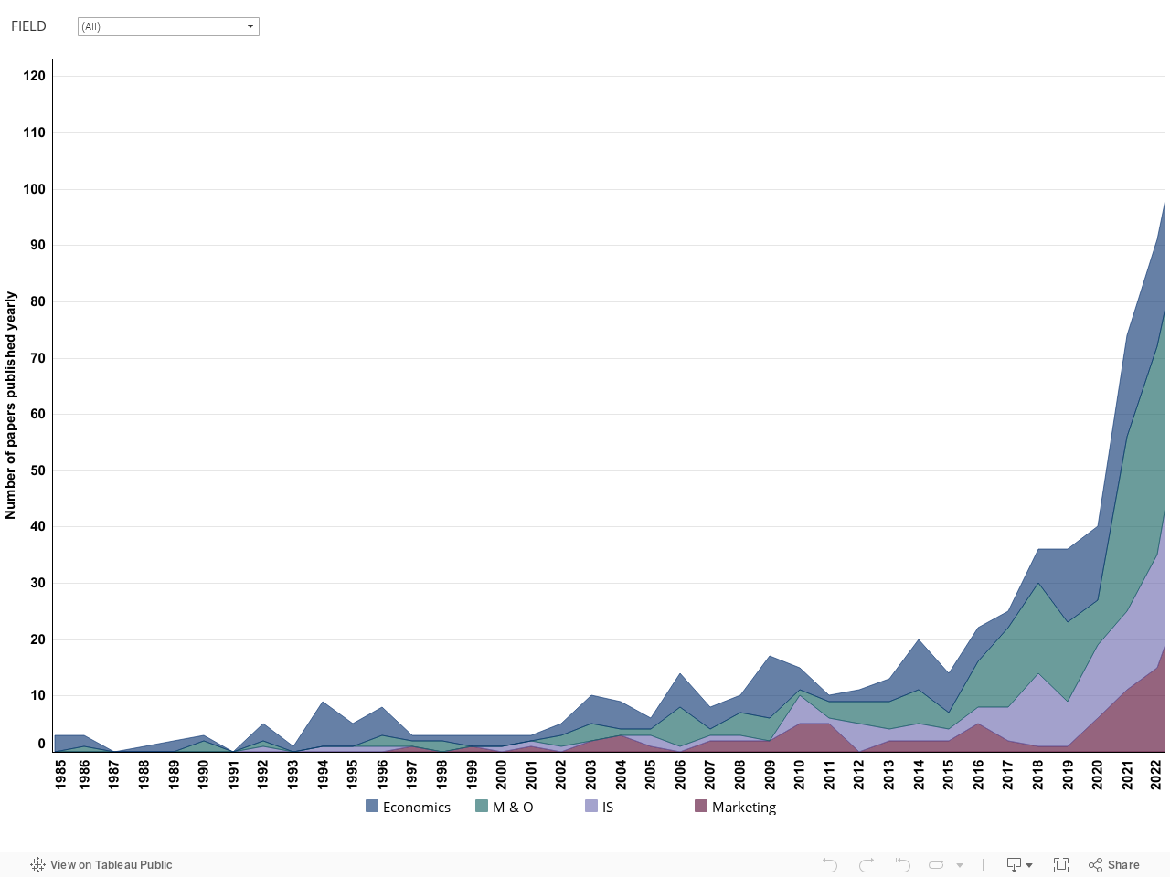
Evolution of the literature. The data visualization below shows the evolution of the literature, by year and field. Note that the Management and Organizations (M & O) and Information Systems (IS) fields have been abbreviated.
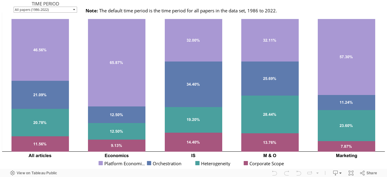
Distribution of themes, by field. The stacked bar chart below presents the percentage of journal articles within each theme by field as well as for the overall sample of articles within the References dashboard.
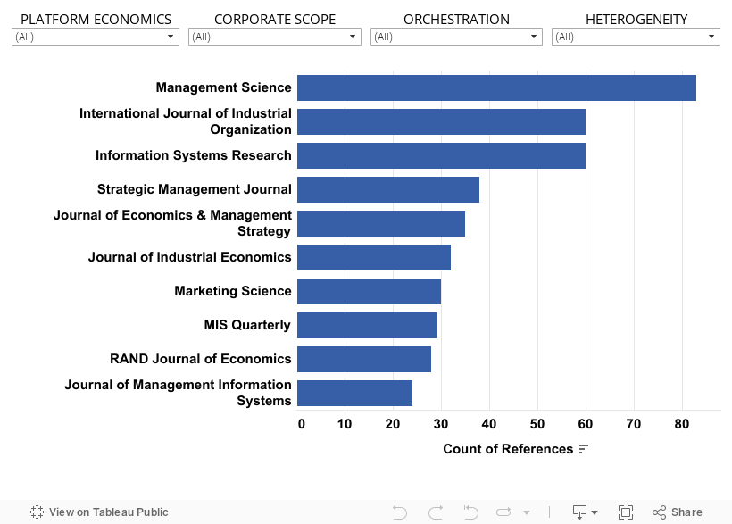
Top journals by publication count. The graph below presents the top 10 journals based on count of article publications (arranged in descending order) out of a total of 47 journals that articles are sourced from in the Reference dashboard.
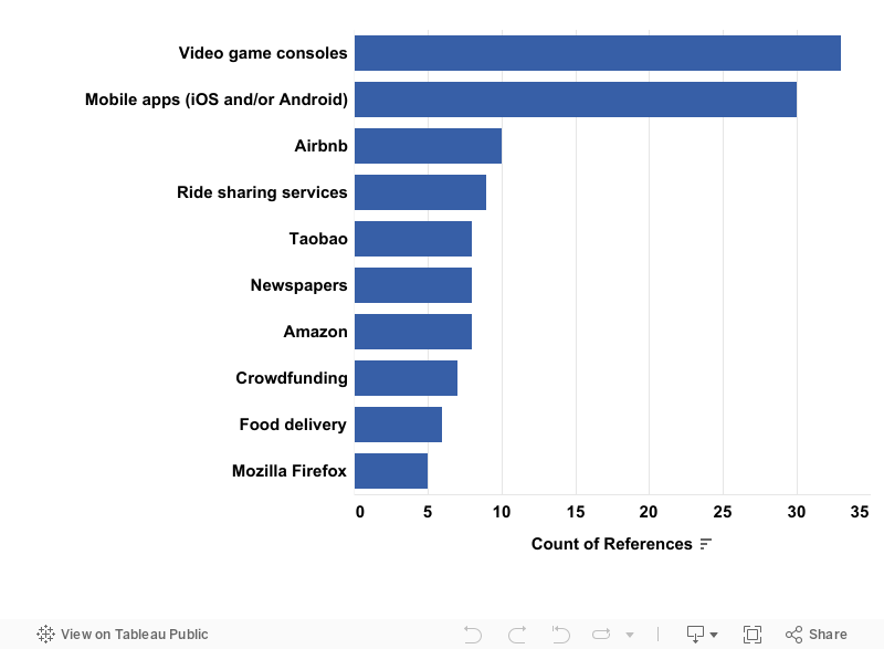
Most analyzed empirical settings. The graph below presents the top 10 most studied empirical settings based on count of journal articles (arranged in descending order) out of a total of 70 empirical settings used by articles in the Reference dashboard.
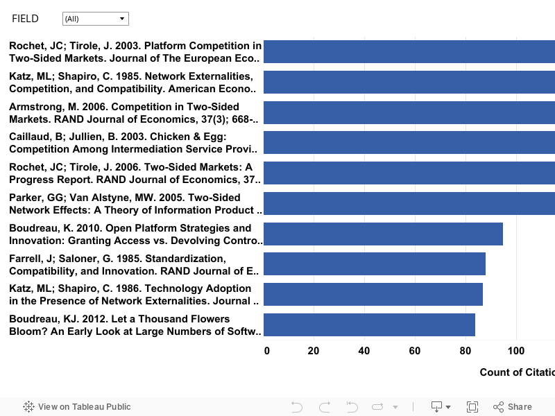
Top articles by citation count. The dynamic graph below presents the top 10 journal articles based on the total number of times that a journal article has been cited by other journal articles in the Reference dashboard dataset (arranged in descending order), which you can filter by field to the left below.
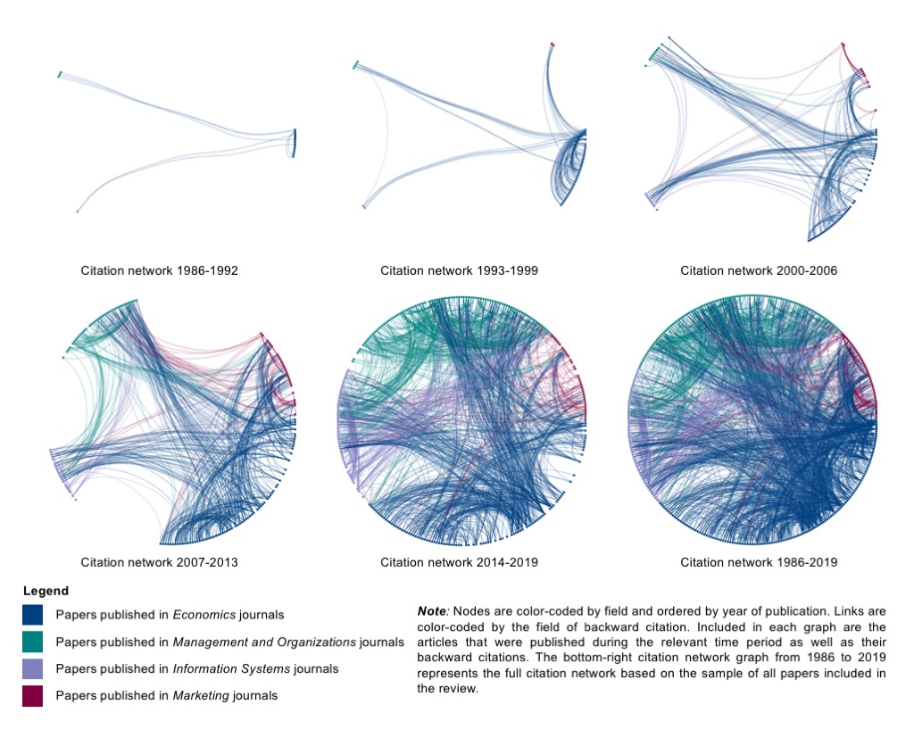
Evolving citation network (1986-2019). The data visualization below depicts the evolution of the literature on platform competition through an evolving citation network, by time period and field.